Or at least, a new logo you’ll be seeing wherever you see us from now on. Find out why, what's new, and what on earth we were thinking as we track our trusty trademark through a brief history of the Harris Hill brand...

Meet the new Harris Hill logo
Yes, as you'll have gathered by now, we've got a (slightly) new look, but it's far from a dramatic departure. More the kind of modest adjustment it’s compulsory to label an 'evolution, not a revolution’ in pieces like these.
It's the first tweak of the design since 2018, and the first of any significance for 15 years, so its time had come.

But I fear change! Why have you done this?
In 2026 we’ll be celebrating 30 years of bringing remarkable people in the charity sector together, so we’re sprucing all kinds of things up to ensure we're in good shape for the next 30 and beyond.
And like any of us after many years of valiant service, our logo was starting to look a little tired and beyond its best. So earlier this year, we decided it was time for something new.
At that point, you're supposed to throw a few £million at a terribly fashionable agency to spend a few months ‘exploring your brand essence’ (cajoling reluctant staff to stick things on mood boards), five minutes on a new design, and a year or two coming up with weapons-grade woo-woo about the way it expresses your values through the shape of the vowels. Or something.
But we didn’t do that. Partly for budget reasons and partly because - as regular readers will know – we’re perfectly capable of coming up with our own meaningless bunkum when required.

One key consideration, however, was that where you encounter our logo has changed dramatically in the past 15 years: you're now relatively unlikely to see it in print and far more likely to do so on-screen, and probably quite a small screen at that, given the proliferation of smartphones. We needed something better suited to that environment.
At the same time, you'll know (unless you're a billionaire buyer of social media platforms) that when you have a well-established, distinctive and successful brand, it's rarely a good idea to throw out everything that made it work.
So with that in mind, we’ve kept our distinctive bright cyan – you wouldn’t have it in your living room but can't miss it even when scrolling at speed – and simply replaced the type with something more legible when small, that’s neither too corporate nor too informal, but hits a sweet spot in the middle that feels very much right for the brand.

What's more, as you'll have spotted immediately, the use of circular dots over the letter ‘i’ is of course a playful representation of our open approach, inspired by our all-encompassing passion for the sector. (See? Perfectly capable).

How did we get here?
We weren’t entirely sure either: although many of us have notched up more than a decade of loyal service, no-one's been here for all three.
But even if you're a logo, you don't get to 30 without a few questionable style choices along the way, so out of curiosity we've trawled the archives and searched the hard drives to bring you - whether you asked for it or not - a brief history of the Harris Hill logo, as seen through generations of the Harris Hill site.
 | | 1996-1999Legend has it that our quest to provide a better recruitment service for charities began above a shop in Kingston in 1996. Sadly there's no trace to be found of our '90s logo, but if what followed was considered an improvement, it looks like we've all had a lucky escape. |
2000Our very first website was unleashed upon the world, proudly emblazoned with this extraordinary creation. The calligraphy! The shadowing! The overall sense of funeral home! It’s really quite...something. As for the tagline below it: ‘Where did you want those capital letters and quote marks?’ ‘Oh, just put them anywhere you like’ To be fair, it was a different time. The 1800s, by the look of it. Still, things could only get better, right? | |
| 2002I may have spoken too soon. By 2002 the world had discovered you could animate parts of your website and everyone was at it. It could have things that moved or flashed. It could have video-like transitions. It could fail to run on most computers and that would just show how cutting-edge you were. Our contribution was to greet visitors to our second website with a mysterious blue circle, upon which the names of our specialisms would gradually appear, sliding to various points around the circle, and when you woke up three hours later you'd be looking at this wilfully-impractical wonder, for which the brief was presumably 'ill-advised and increasingly desperate Top of the Pops rebrand circa 1994'. However, we did at least provide a ‘Skip intro’ button, which in the absence of any earlier sightings I can only conclude we invented, so that’ll be £20 million or so please, Netflix. |
2004A rather more sensible approach had entered the building by the time of the next update, notable for introducing the ‘charity recruitment specialists’ tagline, and for being the first Harris Hill logo you could send to a merchandise printer without reducing them to tears. Bravo and branded stressballs all round. | | 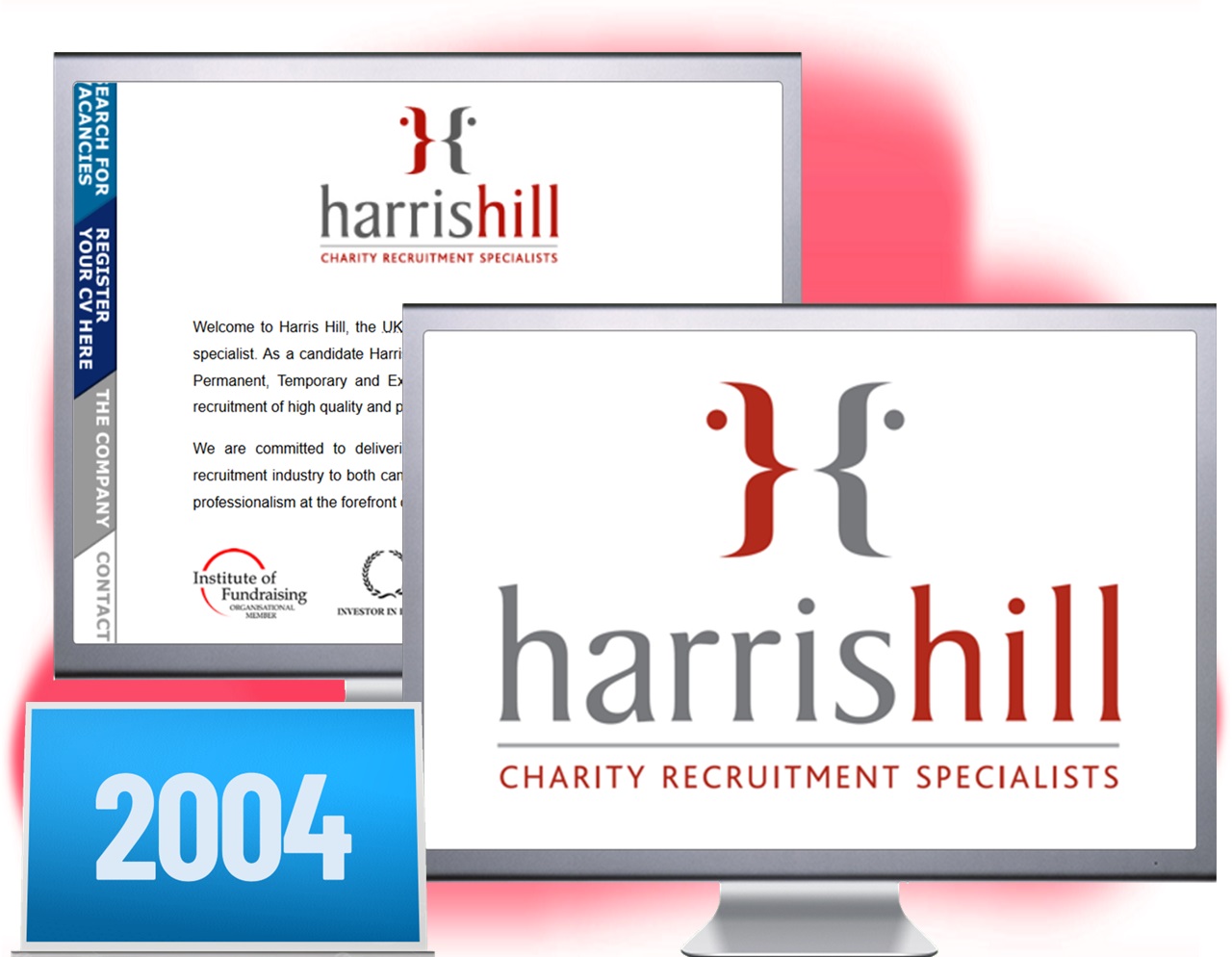 |
| 2007We can't show you our late-noughties website as only the text will display these days. We don’t know what was wrong with the imagery, but when even the internet refuses to show it, it’s surely a bit of a concern. However, other sources show that 2004’s red logo lived on, later joined by assorted purple variants marking the launch of our Executive business. |
2010As political power in the UK switched from red to blue, so too did our logo. Coincidence? Almost certainly, but the 2010 makeover is notable for introducing much of the branding you know and feel largely indifferent to today, with the debut of ‘bringing remarkable people together’ and our now-signature cyan. Look, at no point did I say this was going to be exciting. | | 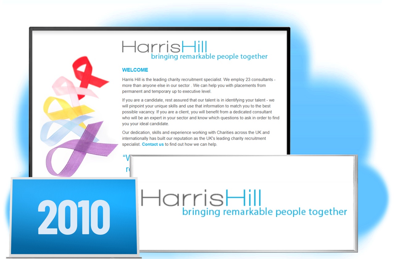 |
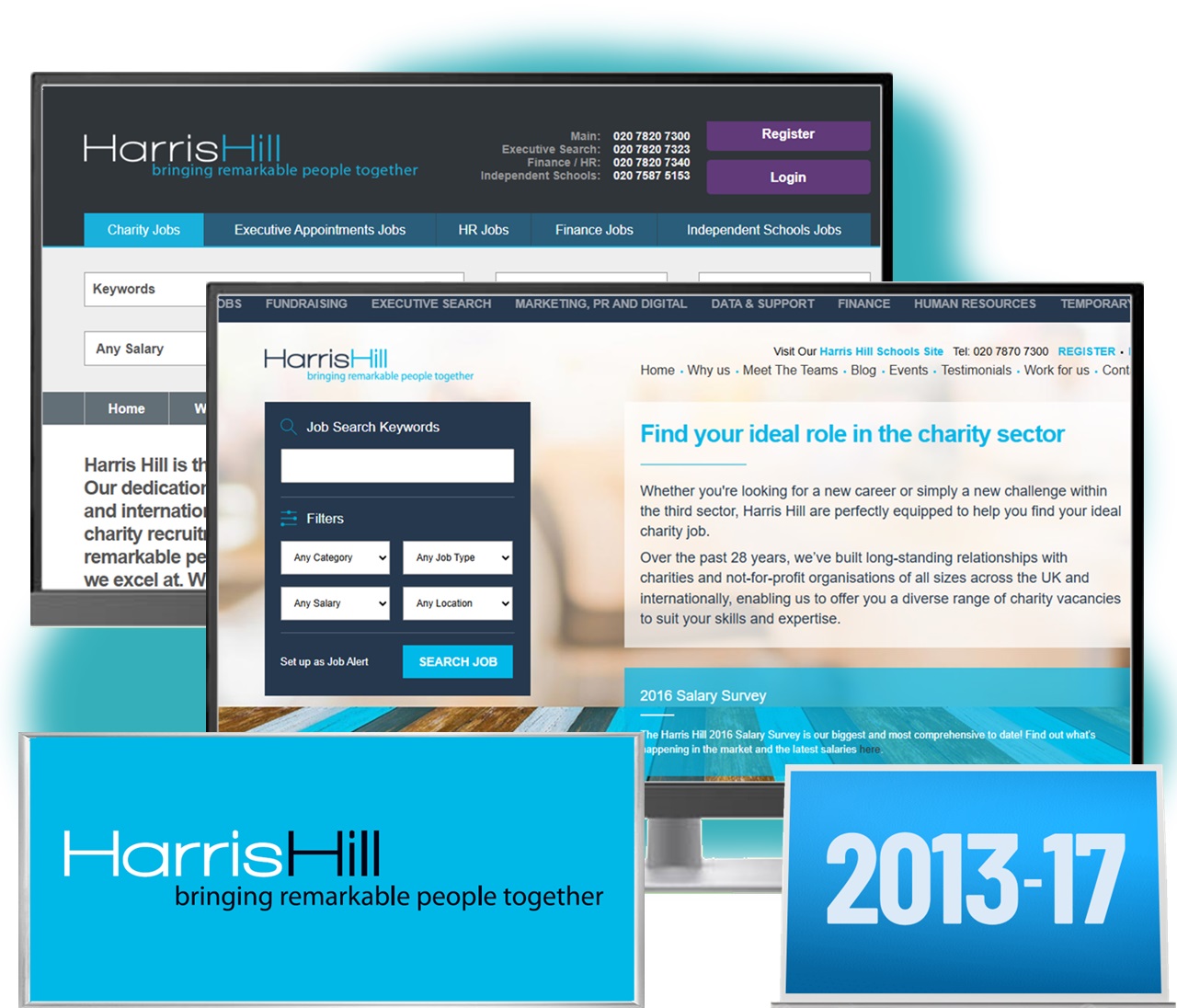 | | 2013-17Some stability at last in the logo's turbulent life, sailing more or less unscathed through the next two generations of our site. Both were externally designed and growing steadily more sophisticated, expanding significantly in 2016 with the launch of the Harris Hill Blog, greater focus on our specialisms, and a standalone site for Harris Hill Independent Schools. |
2018Bringing remarkable people together remains our mission to this day, but it's not the easiest thing to fit into a tiny box on Twitter (RIP). The rise of all things digital called for something a little more compact, so restoring 'charity recruitment specialists’ fitted the bill, as well as providing a succinct description of what we do. For the less observant browser, it also stops us being mistaken for a ski jump, animal hospital or cemetery (see below), or an amusement park, elementary school or nursing facility, although you'd forgive the confusion at times. | | 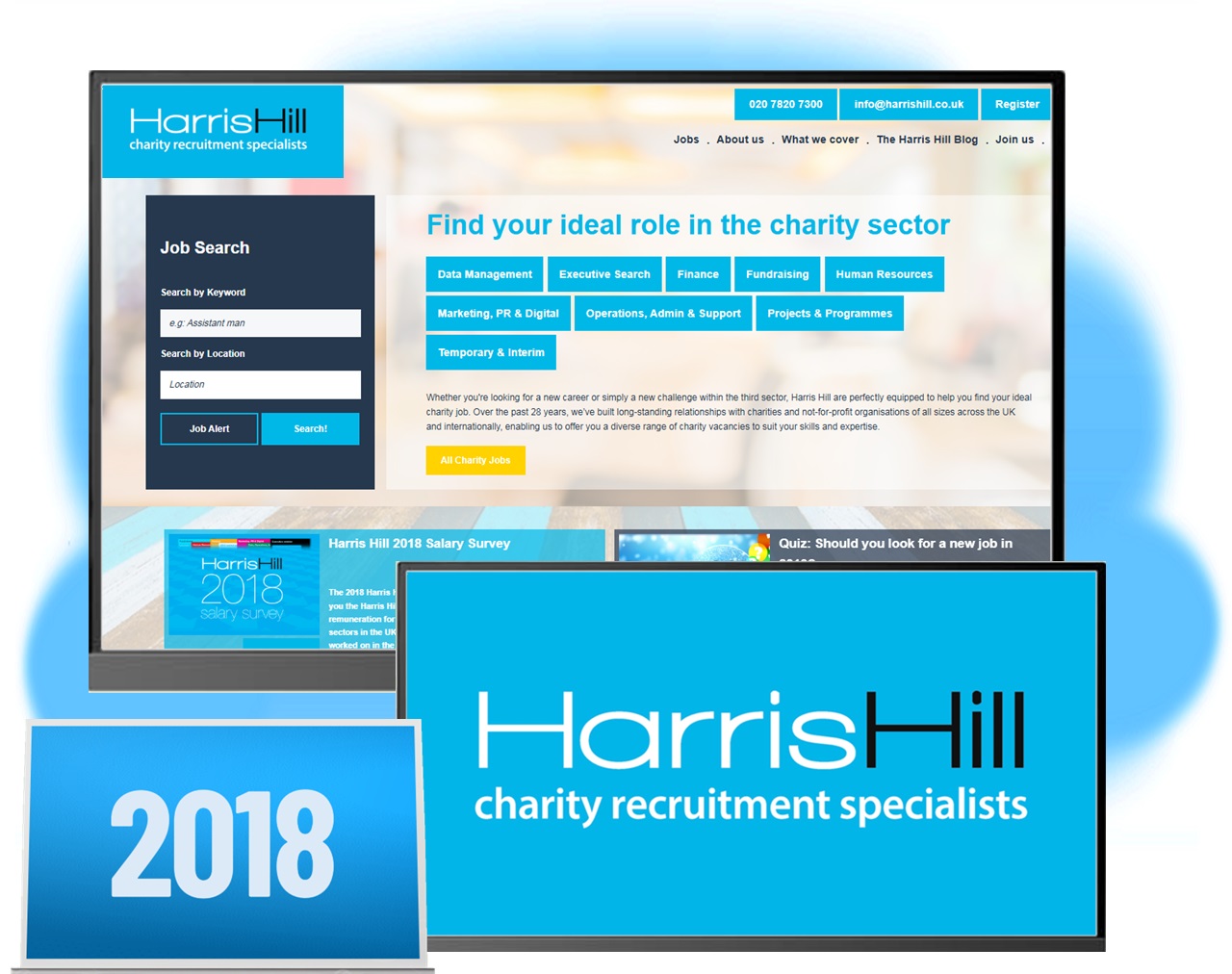 |
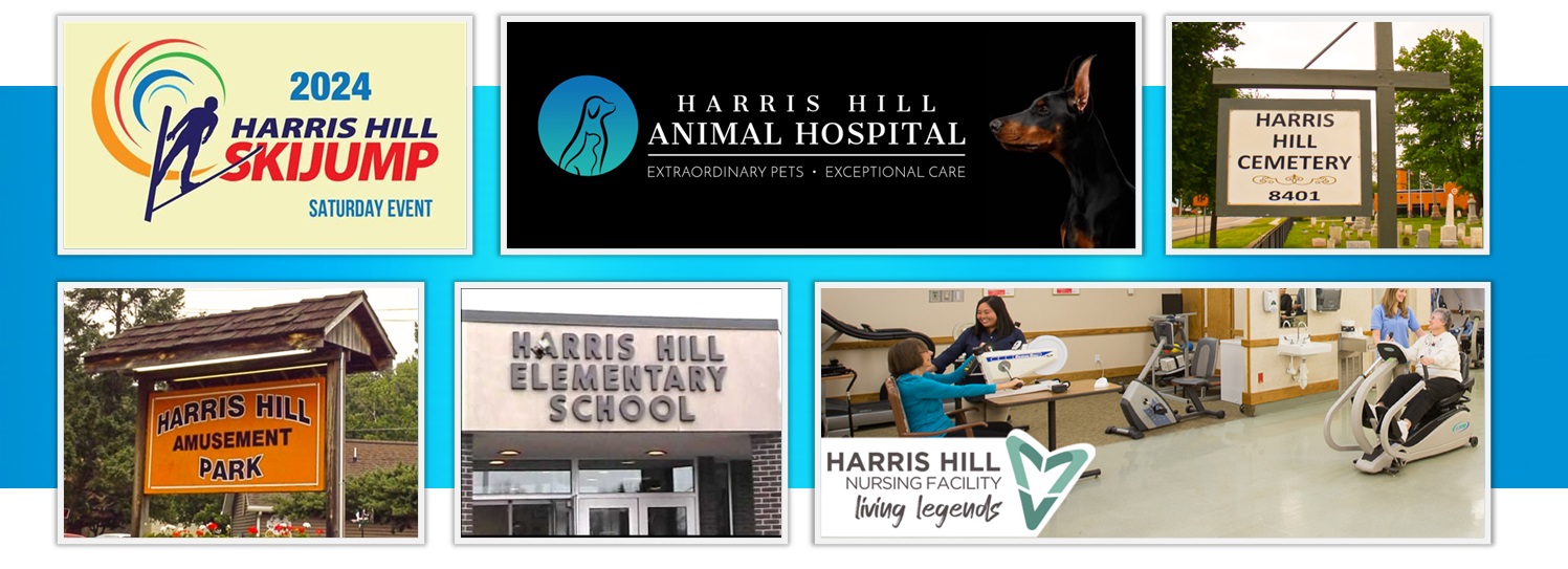
All of which brings us up to the present day and the site you're looking at right now, reading a piece about the launch of our brand new logo. And thus, the circle is complete.
That generally means it's time to go, but we hope it's been enlightening, and if there's anything we can help with regarding a vacancy or your next career move, please don't hesitate to give our specialist consultants a call, or email us on info@harrishill.co.uk
Team HH
| |

-

Opportunity for all
Find out how we’re working to deliver more diverse, equitable and inclusive recruitment…
-

Recruiting a charity CEO?
Our executive recruitment specialists have an exceptional record of successful CEO, chair, trustee and…
-

Charity sector salaries
Our 2025 Salary Survey has the latest rates and expert insight for roles throughout the sector.


